Colours
The relevant data quality information should be available not only based on colours but also based on additional elements, e.g. the amount of an effect size, or a line indicating a range or variance.
Colours in plots
Using ggplot2 allows to manipulate the colours later.
Nevertheless, we recommend the following conventions for colours.
Colours for discrete scales
For discrete scales, such as interviewers or centres, we recommend to generate colour-blind friendly figures (as suggested here; we have augmented the list by two colours: grey and brown).
| QS_Name | hex_code | red | green | blue |
| qs_black | #000000 | 0 | 0 | 0 |
| qs_gray | #B0B0B0 | 176 | 176 | 176 |
| qs_orange | #E69F00 | 230 | 159 | 0 |
| qs_skyblue | #56B4E9 | 86 | 180 | 233 |
| qs_green | #009E73 | 0 | 158 | 115 |
| qs_yellow | #F0E442 | 240 | 228 | 66 |
| qs_blue | #0072B2 | 0 | 114 | 178 |
| qs_red | #D55E00 | 213 | 94 | 0 |
| qs_purple | #CC79A7 | 204 | 121 | 167 |
| qs_brown | #8C510A | 140 | 81 | 10 |
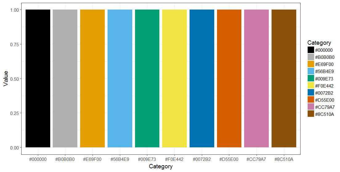
These colours are not recommended for the representation of data quality issues.
Colours for continuous scales
For continuous scales, such as magnitude of effects, we recommend to generate colour-blind friendly figures, as recommended here. Alternatively, we recommend the use of Viridis.
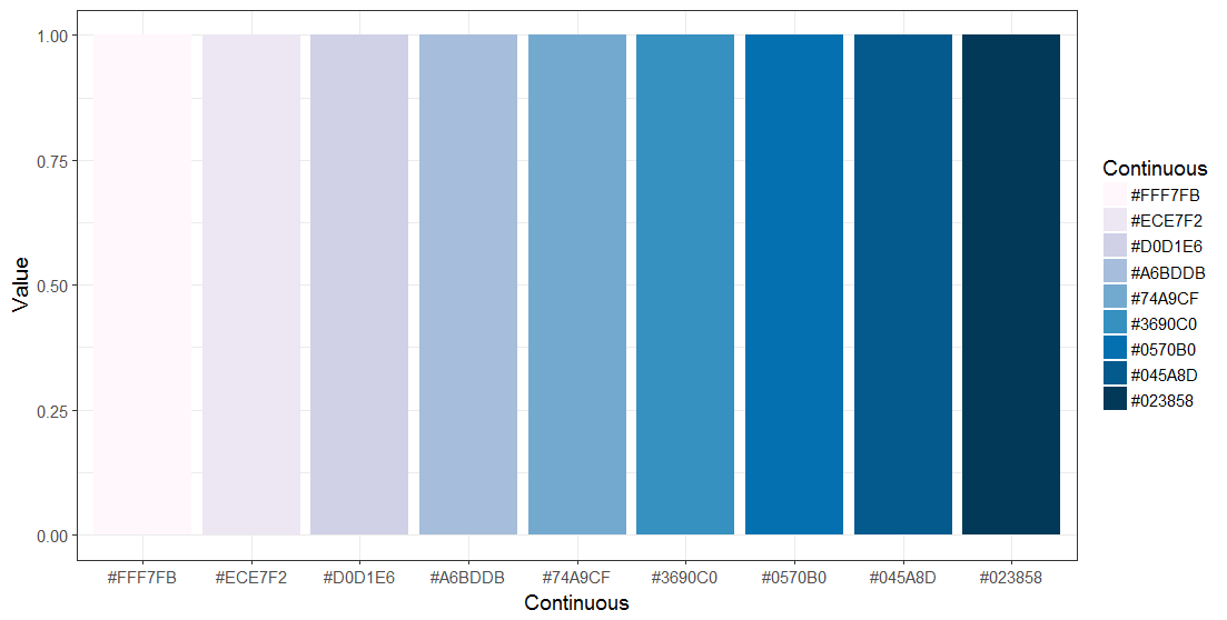
These colours are not recommended for the representation of data quality classifications.
Colours indicating the magnitude of data quality issues
To graph data quality issues, we recommend to generate colour-blind friendly figures, as recommended here.
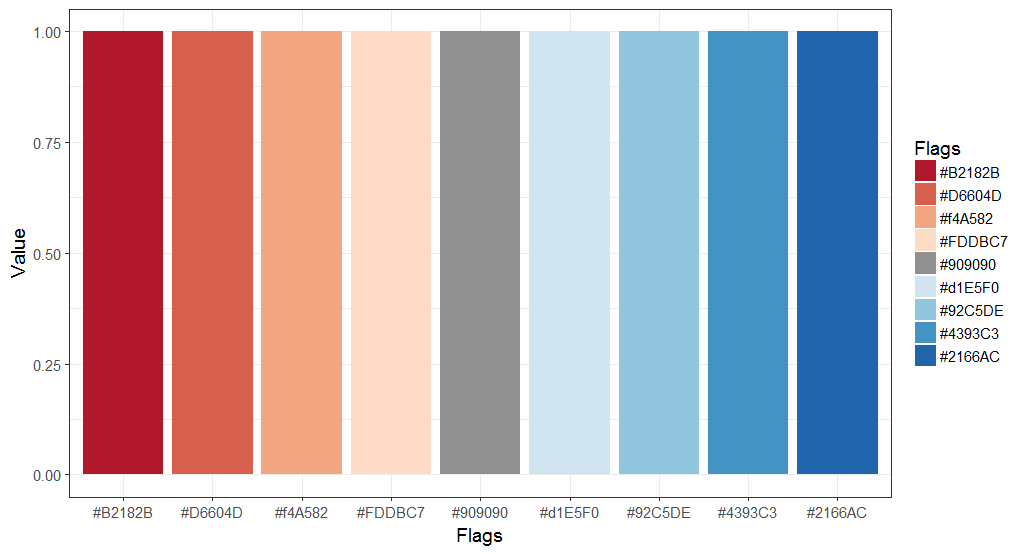
The red pole should always be used to identify problems.
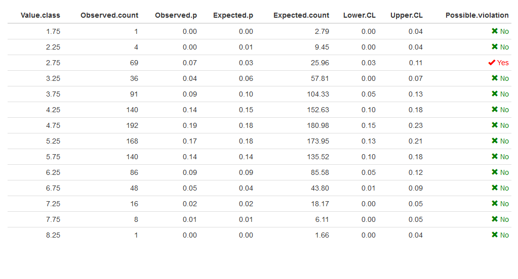
Colours in tables
We assume, a function produces the following data frame:
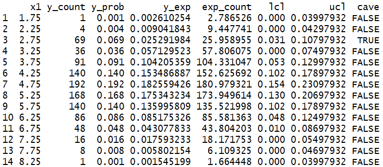
Using the R-package formattable this data frame can be
formatted as follows (crude example):
Please see some annotations on the use of this R-package; other important options are datatable (DT) and knitr::kableExtra
Colours for tables should be based on the colours mentioned above for graphical output.
